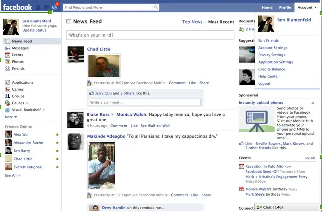
I’ve been waiting for Facebook to roll out the new and simplified home page on my account for the past couple of days and awhile ago, it finally did. I thought Facebook was acting up again as it did the past couple of days. Anyway, there it was – the new Facebook home page. And do I like it? Like with previous Facebook enhancements, I always welcome changes and enhancements with glee. And while the new Facebook home page looks all sleek and dandy right now, some of you may find it a bit confusing, like I did.
Let’s take a look at what were changed in the new Facebook home page. First thing you’d notice is that the search box which is now located at the top left corner of the page. In between the search box and the Facebook logo are the new request, messages and notifications icons.
Then on the left side, you’d also noticed something different, particularly the lower portion where it now lists your friends who are currently online. Clicking on any of your friends will fire up Facebook chat.
Now if you go back to the upper portion and click any of the content links, say photos – it will give you all the photos of your friends not your own photos. This got me confused a bit as I was hoping to see my uploaded photos rather than my friends’.
Another thing that got me confused is the News Feed. Wasn’t it just recently that Facebook introduced Live Feed and News Feed? It seems that Facebook heeded the complaints of many Facebook members and decided to let go of the Live Feed stream. You are now given instead two options of viewing News Feeds – the Top News and Most Recent. The later of course replaces the previous Live Feed, although the time difference between these two can be as short as a couple of hours.
Overall, I find the new look and organization of the Facebook home page refreshing. It sort of gives you a fresh new start at your Facebook experience.
So how do you like the new Facebook home page so far? Any complaints? Please share it with us by leaving a comment.
