There is the old saying that the sea is the perfect cure for anything – from the mother of all hangovers to a broken heart! If you have tried going away and spending time at the beach during low times, then you will, in all probability, attest to that statement.
Then again, as I always say, perspective is everything. And with this Perpetual Ocean project, NASA has given us a different perspective on the oceans of the world.
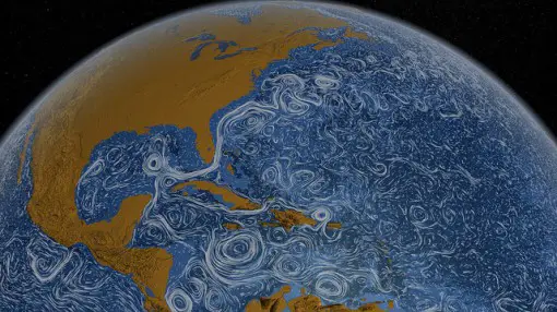
What you see up there is not a classic painting, but an image produced by the NASA Goddard Space Flight Center. ((NASA Goddard Flickr)) NASA’s Perpetual Ocean visualization highlights the ocean currents all over the world from June 2005 to December 2007. Using whatever high tech methods available to them, the team has come up with visualizations of the oceans, and the result is something absolutely stunning, not to mention mesmerizing. Here’s the technical part: ((NASA))
This visualization was produced using NASA/JPL’s computational model called Estimating the Circulation and Climate of the Ocean, Phase II or ECCO2.. ECCO2 is high resolution model of the global ocean and sea-ice. ECCO2 attempts to model the oceans and sea ice to increasingly accurate resolutions that begin to resolve ocean eddies and other narrow-current systems which transport heat and carbon in the oceans.The ECCO2 model simulates ocean flows at all depths, but only surface flows are used in this visualization. The dark patterns under the ocean represent the undersea bathymetry. Topographic land exaggeration is 20x and bathymetric exaggeration is 40x.
I honestly do not grasp all that stuff, but who needs to? I suggest you watch the video here. You can complain if it doesn’t stir something up inside you, but I highly doubt that that will be the case.