If you’re a regular Google Search user, you may have already noticed something different in the Google Search Results Pages starting this morning. Google has rolled out several enhancements in the user interface of the Search Results Pages including a redesigned Google logo.
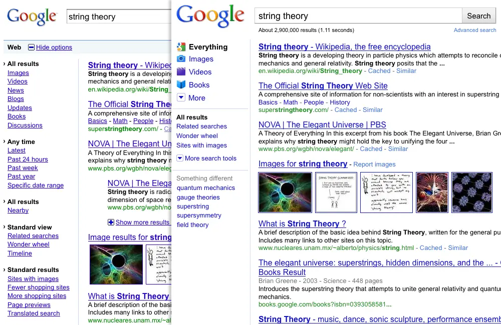
In case you haven’t seen it here’s how the new Google Search Results Pages look like side by side with the old interface:
As you can see, the left-side navigation was change drastically with the inclusion of cute icons representing the different search verticals which you may want to check whenever you want to filter results for your searches. Just below these search verticals are different ways by which you may want to view your search results such as the Wonder Wheel, Google Squared View, Image-less views and more.
The Official Google Blog tells us:
The new design refreshes and streamlines the look, feel and functionality of Google, making it easier to pinpoint what you’re looking for. It’s powerful, yet simple. Today’s changes are the latest in our continuing efforts to evolve and improve Google. We’ve been testing these changes with users over the past few months, and what we’re launching today reflects the feedback we’ve received.. We want to ensure that the Google you use today is better than the one you used yesterday, and these latest changes open up many possibilities for future features and enhancements.
So, do you like the new look and feel of Google’s search results pages? Do you find it useful or you don’t mind at all? Anybody noticed its striking resemblance to Microsoft Bing’s search results pages?
Incidentally, if you’re using Google Mobile Search, that same interface was also rolled out.
